| |
 |
StatEL : Descriptive Statistics
|
|
|
|
| |
1 - Launch of descriptive statistics calculation :
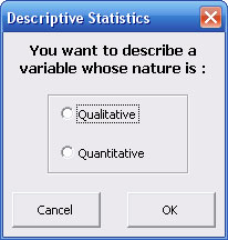
StatEL needs you to specify which kind of variable you want to study (qualitative or quantitative) :
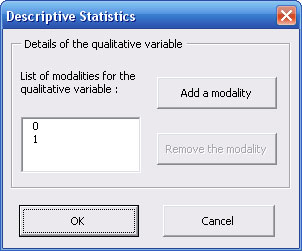
If you choosed "Qualitative Variable" option, you have to define modalities of the variable :
By default, modalities of the qualitative variable are defined by "0" and "1". You can remove them by clicking on "Remove modality" button. Then specify one by one each modality of the variable by clicking on "Add a modality".
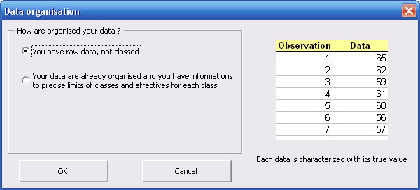
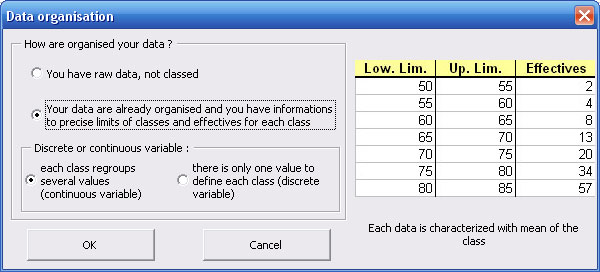
In case of study of a quantitative variable, StatEL is able to work on :
- raw data for which you can :
- let StatEL cut on its own the full selection in K classes,
- specify the gap between limits of each class,
- specify the number of classes in which StatEL must split the effectives,
- organized data and you have informations relative to organization of data (lower and upper limits for each class, effectifves).
Then, whatever the kind of variable (qualitative or quantitative), StatEL just requires that you select the cells range related to data whose you want to test normality distribution. To proceed the selection, you just have to clic on the first cell of your data with the mouse and to stretch until the last cell of your data.
If you did wrong, you just have to try again, new selection will erase references of previous selection
2 - Results of descriptive statistics calculation :
Results display on a new sheet of your Excel file.
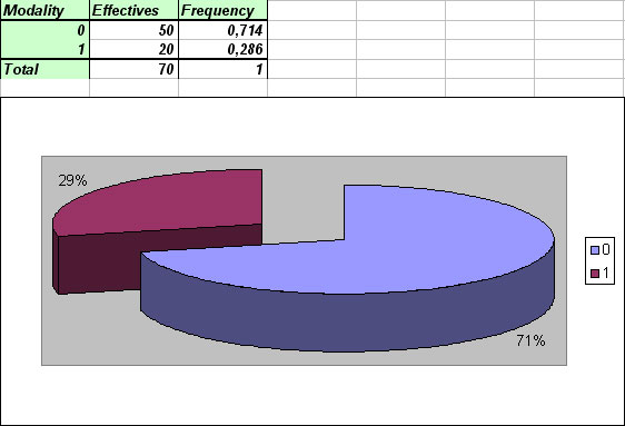
2.1 - Descriptive statistics for qualitative variable :
Results display selected data on the left part of Excel sheet, and on the right, repartition of different modalities you defined, in effectives and percentage. At last, a graph is automatically drawn to illustrate results.
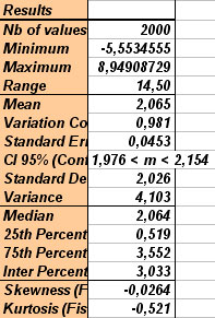
2.2 - Descriptive statistics for quantitative variable :
On the left part of Excel sheet, results display selected data and their repartition according to different classes, and on the right part :
- number of data (n),
- minimum value (min),
- maximum value (max),
- range,
- mean (m),
- variance coefficient (m/Sd, allows to compare variability of several measures with different units),
- standard error of the mean (estimation of standard-deviation of the mean),
- 95% CI (95% Confidence Interval of the mean, i.e. interval in which mean of the population has 95 chances on 100 to be really),
- standard-deviation (Sd) which is square root of variance (in the same unit than mean),
- variance (s²) which is the major measure of variability for a data set,
- median whiwh is a measure of central tendency (this is the value for which one-half [50%] of the observations [when ranked] will lie above that value and one-half will lie below that value),
- quartile 25% (1st quartile, value such that 25% of the values of the variable fall below that value),
- quartile 75% (3rd quartile,value such that 75% of the values of the variable fall below that value ),
- skewness (measures the deviation of the distribution from symmetry, if the skewness is clearly different from 0, then that distribution is asymmetrical , while normal distributions are perfectly symmetrical),
- kurtosis (measures the "peakedness" of a distribution, iIf the kurtosis is clearly different than 0, then the distribution is either flatter or more peaked than normal; the kurtosis of the normal distribution is 0.
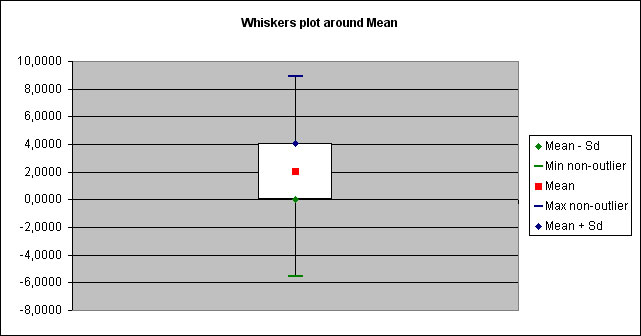
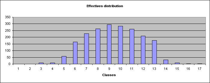
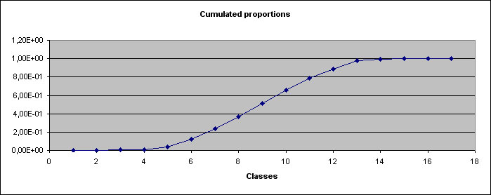
At last, 3 graphs are displayed :
- a "Whiskers plot"
- a histogram graph for repartition of values according to classes,
- a curve graph for cumulated proportions of every classes.
The 2 former graphs allows you a graphic evaluation of normality of the distribution : if distribution is normal, histogram graph should represent a Gauss curve (like above), whereas curve graph should represent a "S" shaped curve whose inflexion point coincide with sample mean.
|
|
|
| |
|
ad Science Company - 55, Boulevard Pereire, 75017 PARIS - France
|
|
|
|